Role
Sole UI/UX Designer
Company
Palisaid
Timeline
2023-2024
Skills
UX Research · UI Design · Systems Thinking

Designing a Charting System Educators Could Use While Teaching

Diabetes educators were switching between paper forms, PowerPoint, and the EHR during every class. I redesigned the workflow into one system that helped them teach, track patient progress, and complete documentation without leaving the session.

Problem
Educators lost 15+ min per session to manual documentation
Users
Diabetes educators at DSME clinics
Outcome
One workflow for teaching, charting, and EHR submission
Approach
Interviews · Competitive Analysis · Iterative Prototyping

The Problem in Practice

What Educators Were Actually Doing Before

A single session ran across three disconnected tools. Patient data entered on paper had to be manually re-entered into the EHR. Nothing transferred automatically.

PowerPoint
Lesson slides advanced manually. No connection to patient data. No way to reference individual goals mid-class.
+
Paper Forms
Patients filled out handwritten goal-setting forms on arrival. Often incomplete. Handed to the documenting educator mid-session.
+
EHR System
A separate system with no link to the paper forms. After class, educators transcribed patient data into it by hand.
Cost of the paper-based workflow
15 min
Lost to form collection and sorting before each session
2 staff
Required per session to keep teaching and documentation running at the same time
0 data
No system for tracking patient progress or outcomes across sessions

What I Heard From Educators

I interviewed diabetes educators and program managers to understand how group classes actually run. Four constraints came up in every conversation.

Educators Struggle Balancing Teaching & Documentation

One educator teaches. A second handles documentation. Even with two staff, there still isn't enough time to do both well.

Patient Pre-Class Forms Are Often Incomplete

Patients don't always complete pre-class questionnaires. Many arrive unprepared, so educators spend 10-15 minutes per session helping them catch up, cutting into teaching time.

The Form Had to Work While Someone Was Teaching

Current documentation methods are too slow for a live class. Educators need quick-select inputs, not text fields. Printed materials are still the norm, and they go missing or stale.

Attendance Is the Only Metric, and It's Manual

Attendance is tracked manually, which is slow and error-prone. There's nothing tracking patient progress, engagement, or outcomes across sessions.

"The hard part was never adding features. It was building a form someone could actually fill out while teaching ten people at once."

The Solution

What the Redesign Made Possible

Four screens that keep everything in one place: the class dashboard, in-session charting with medical history, auto-filled forms, and the pre-class checklist.

Class Management From One Screen

The dashboard brings upcoming classes, patient progress, and lesson materials into one system. Educators stay in it for the full session.
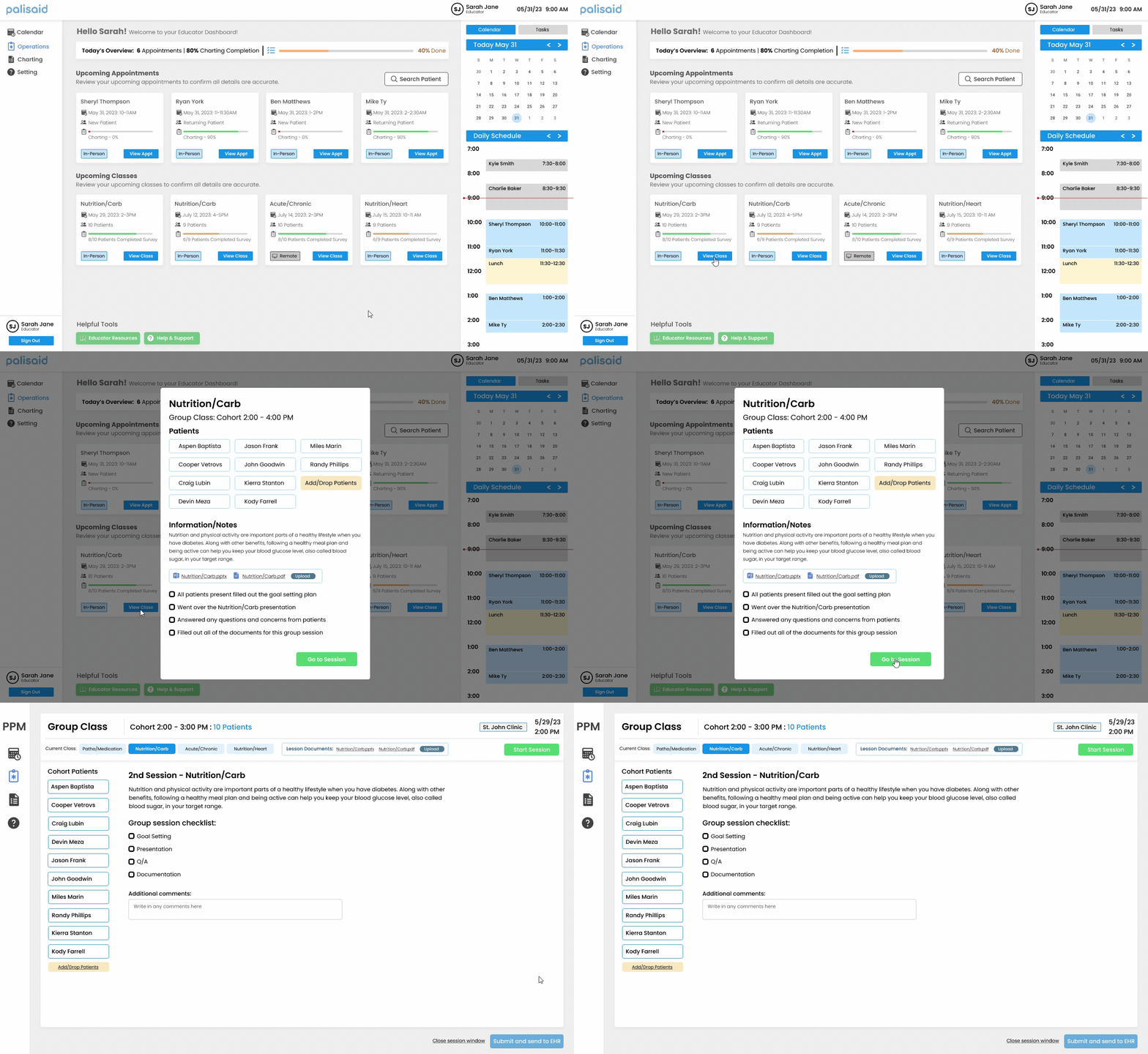
Class management dashboard

Charting & Medical History in One View

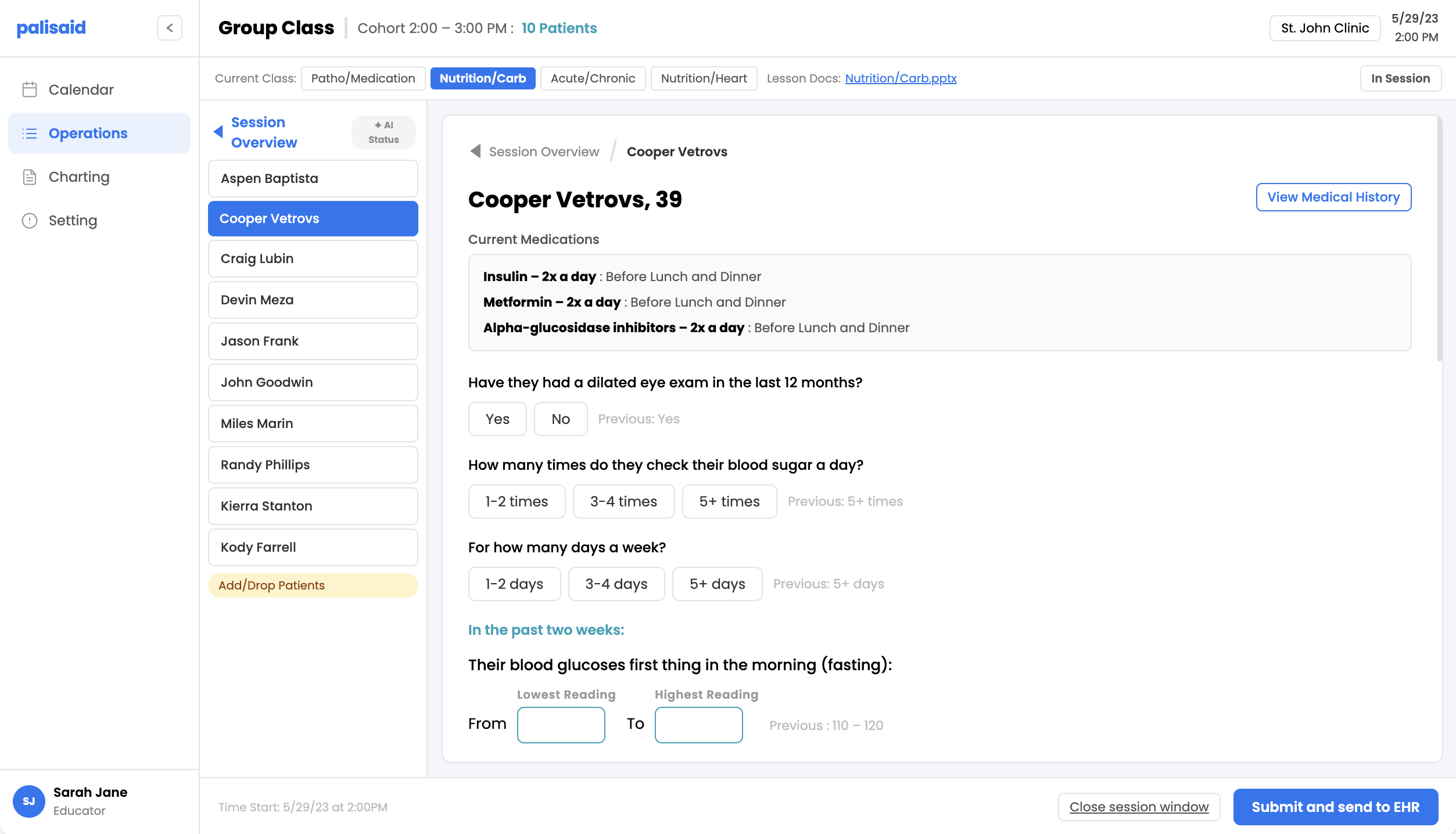
Educators chart each patient with the full medical history and medication list visible the whole time, right beside the form.
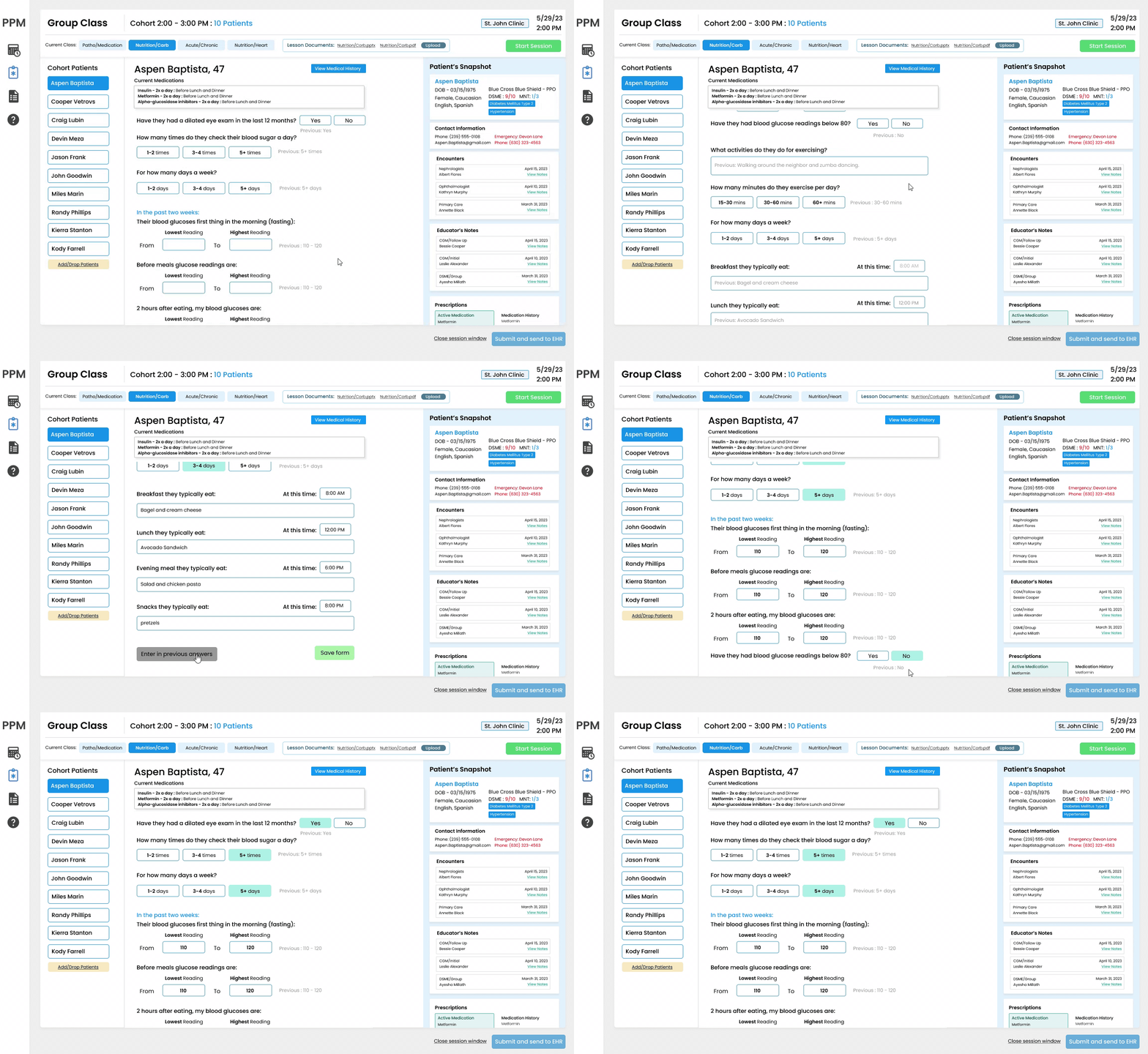
Charting with medical history

Previous Entries Auto-Populate

Past session responses pre-fill the form and sit next to each question. Educators confirm what changed instead of re-entering everything.
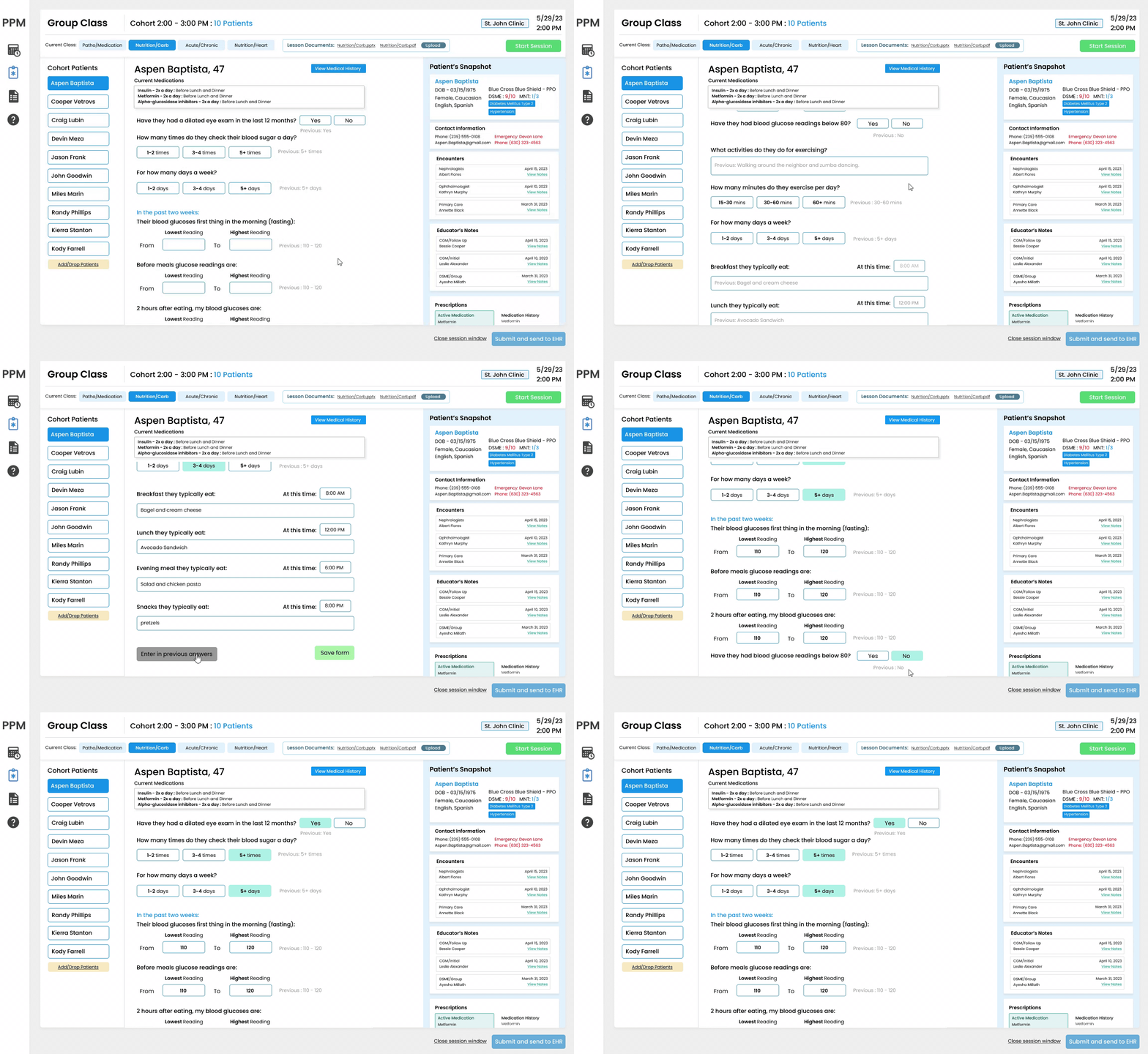
Auto-populated previous entries

Session Checklist Before Class Begins

Before class starts, educators confirm session details, work through the checklist, and see which patients completed their pre-class forms.
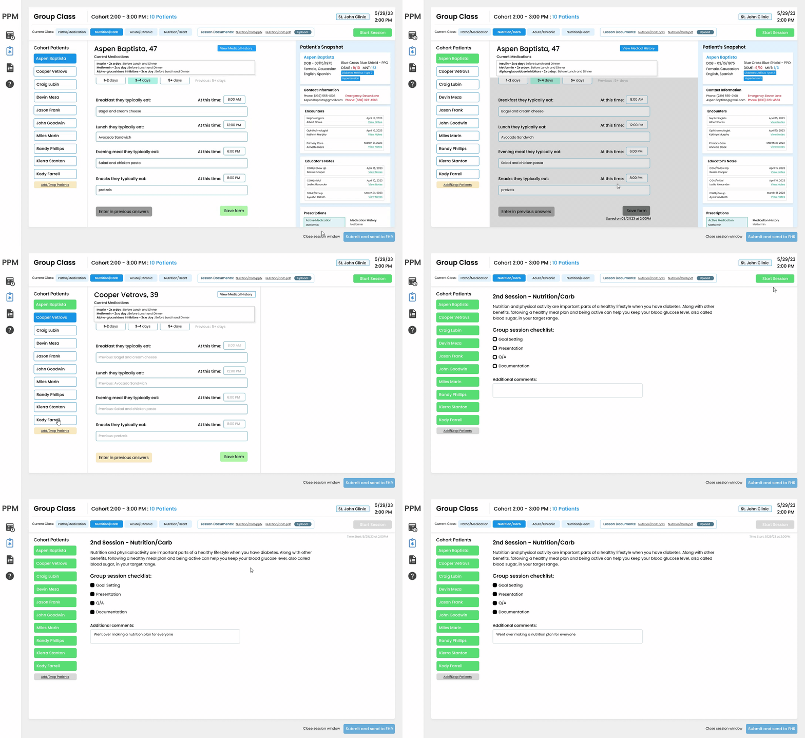
Pre-class session checklist

The Business Case

Faster Sessions, More Cohorts, More Revenue.

Medicare reimburses clinics per patient per group session under code G0109. The faster a clinic runs a session, the more cohorts it can schedule. This tool directly supports that math.

$15.20
Medicare reimbursement per patient per 30 min (G0109, 2025)
$304
Revenue per 1-hour session with 10 patients
$608
Revenue per 2-hour session with 10 patients
$1,824
Potential weekly revenue running 3 cohorts at full capacity
Time saved
Before
~15 min admin + 45 min teaching
After
~5 min check-in + 55 min teaching

10 extra minutes of teaching per session. Across 3 cohorts/week, that's 30 minutes of patient care time returned every week.

Staffing saved
Before
Teaching
Documenting
2 educators required per session
After
Teaching + charting
1 educator can manage both

Freeing a second educator means clinics can run parallel cohorts instead of dedicating two staff to one class.

Projected impact based on interview findings. Not yet validated in live sessions.

The math

One educator per class means more classes

+2
cohorts a weekthe freed second educator runs parallel classes
×
$608
per cohort10 patients, 2-hour class, Medicare G0109
×
48
teaching weeks a year
=
~$58K
added group revenueper clinic, per year, same staff

Running three cohorts at full capacity is ~$1,824 a week, and none of it requires a second hire. Projected from interview findings, not yet validated in a live clinic.

Competitive Analysis

Every tool covers part of this. None do the whole group-class workflow.

I looked at the software a diabetes educator actually touches, from the ADA's own documentation platform to the enterprise EHRs. Each solves a slice. The gap is a guided workflow built for teaching a class that also submits to the EHR and drafts the documentation.

ToolWhat it isGuided DSME flowEHR submissionAI documentation
Chronicle Diabetes (ADA)DSMES documentation
EpicEnterprise EHRConfigurable
Oracle Health (Cerner)Enterprise EHRConfigurable
GlookoDiabetes data platformAnalytics only
Cecelia HealthVirtual diabetes clinic
Welldoc (BlueStar)Digital therapeuticPatient-side
My designGroup lesson charting + education

Design Process

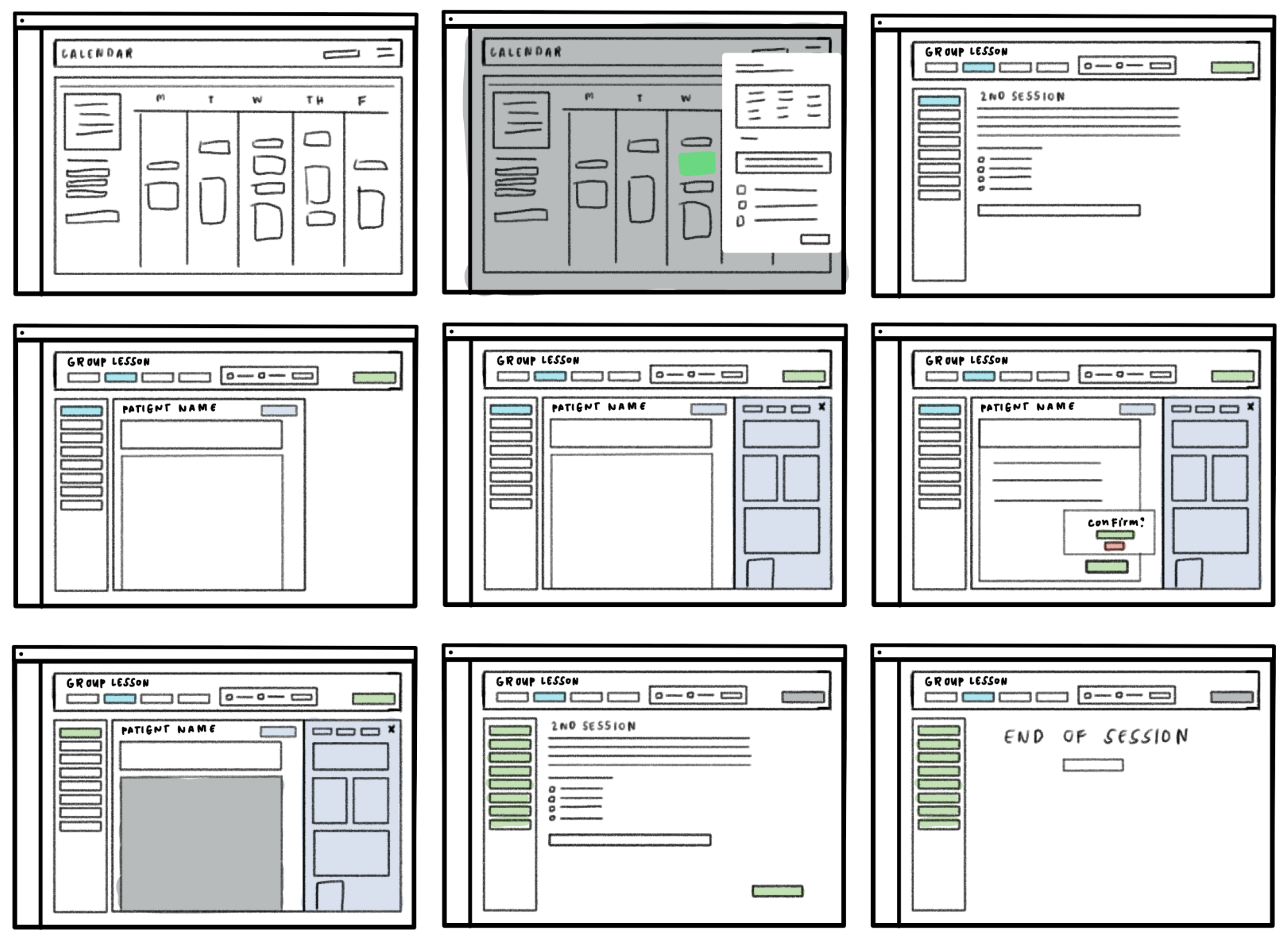
Mapping the Whole Session on One Surface

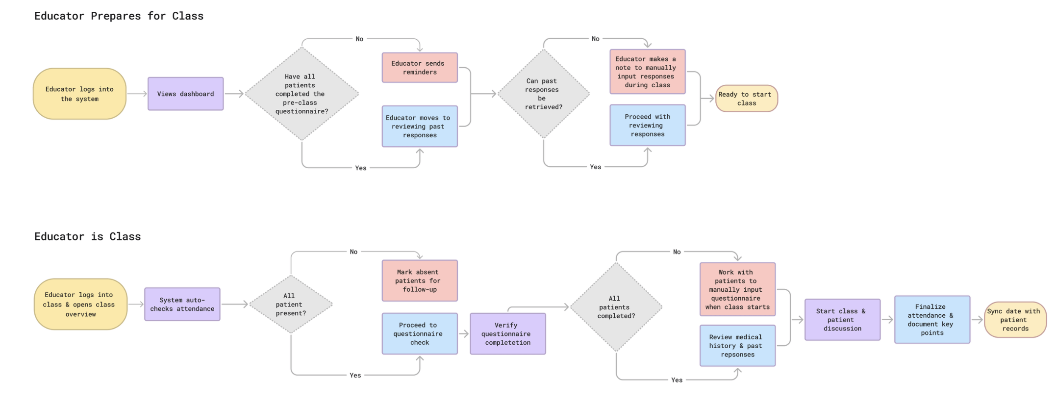
I mapped the full session from pre-class to submission. Seeing every step in one place made it easier to spot where time was leaking and where the design could actually help.

Design Iterations

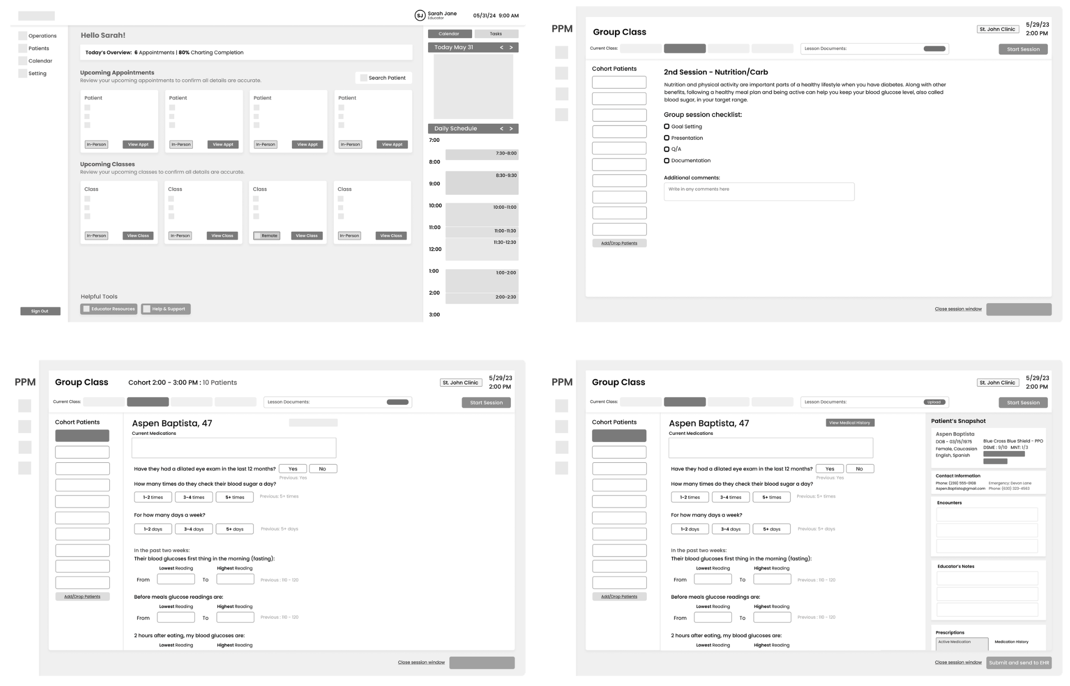
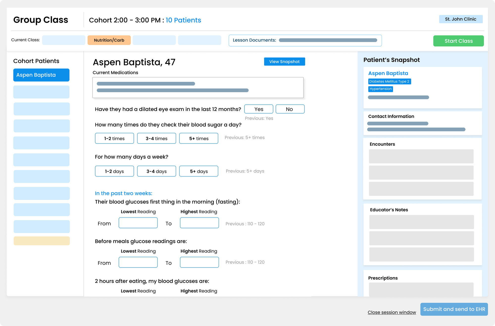
Seven iterations before I landed on the final design. Each one closed the gap between what I assumed and what the research showed.

Early sketches

Wireframe iterations

✕ Scrapped
Version 01
First iteration with horizontal patient tabs

Horizontal Patient Tabs

My first pass was a digital copy of what educators described to me. I designed what I heard, not what would actually work better.

The problem With 10 patients, the tabs fall off the screen entirely. And free-text fields meant educators were still typing everything: paper's problem, moved to a screen.
✕ Scrapped
Version 02
Second iteration with vertical patient sidebar

Vertical Sidebar, Still All Typing

A lot of EHR systems use vertical list navigation, so I tried that next. But the form still leaned on typing, the exact problem research had flagged.

Closer, but The sidebar was the right call. But no previous session data, no snapshot panel, no quick-select toggles, still too much manual input for someone teaching at the same time.
✓ Final
Version 07
Final design with snapshot panel and toggles

Quick Selects, Context on Demand

Replaced most text inputs with toggles and selectors. Added previous session answers inline so educators see changes right away. The snapshot panel keeps patient context in view without leaving the charting screen.

What changed Designing for someone who is teaching and charting at the same time, not just documenting after the fact.

Systems Thinking

Designing for Real World Constraints

These are the edge cases I designed for, pulled from interviews and conversations with our engineers.

Patient joining late or no show

The Add/Drop button lets educators update the roster mid-session without navigating away. A no-show is marked directly on the patient card, keeping the cohort count accurate for billing.

Pre-class forms not submitted on time

The pre-session checklist shows form completion at the cohort level before class starts. Educators see who submitted and who didn't before opening a single chart.

EHR submit is one-shot per session

Each EHR submission costs money, so the system is designed around getting it right the first time. The billing readiness screen flags every incomplete field before the educator hits submit.

Running the class solo

This was the core constraint the whole system was built around. Every interaction needed to work for one person teaching and charting at once, with no second staff member to offload to.


Interactive Prototype

Built with AI

Static mockups only show part of the story. I built an interactive prototype so reviewers could experience the full group lesson workflow instead of imagining it from screenshots.

Static design
Figma mockup
A polished screenshot, but reviewers can't feel the workflow. They have to imagine teaching a class through it.
AI-assisted prototype

Built from my Figma designs using Claude Code and React.

Built with React · Mock AI · No install
Screens Dashboard → Checklist → Charting → Billing
AI features 7 distinct interactions
Patient data 10 patients · Full charting flow
A Possible Next Layer

Where AI Could Enter the Workflow

I explored where AI could reduce cognitive load without adding extra steps. Each idea came from a real moment in the educator workflow.

Pre-Session

The AI Pre-Brief

One panel: who to watch today, last session's unmet goals, and who hasn't submitted their pre-class form.

WhyEducators rebuilt last week's context from memory. This hands it to them up front.
During Charting

Goal Check + Recommendations

As the educator charts, it flags whether last session's goals were met and suggests activity, nutrition, and monitoring next steps.

WhyThe insight comes from clicks they're already making, no extra step.
Post-Session

Billing Readiness Score

The close screen shows a live G0109 readiness score and one-click fixes for any missing field.

WhyReimbursement needs a complete chart. This catches gaps before submit, not at billing.
Try it
Guided Tour
Step 1 of 8
Complete the action in the prototype to continue.
ppm-group-class-prototype
Open full screen ↗

Reflection

What This Project Taught Me

This one pushed me to design for constraints I hadn't hit before. A few things I'd take with me.

What Slowed Me Down

I tried to solve for every clinic's workflow at once. The research kept pointing me back to the same core constraints, and a simpler system was the right call.

What I'd Do Differently

Start simpler. Test with real educators sooner. The final design ended up leaner than the fourth iteration.

What's Next

EHR integration has to flex to different clinic setups, and that's the hardest part to get right. Next is testing in live sessions to see where the workflow holds and where it breaks.