Role
Sole UI/UX Designer
Company
Palisaid
Timeline
2023
Skills
UX Research · UI Design · Systems Thinking

Individual Patient Charting for Diabetes Educators

A unified charting system that helps diabetes educators document visits, track goals, and submit to the EHR in one guided workflow, from prep to submission.

Americans with diabetes
40.1 million (12% of the U.S. population) CDC National Diabetes Statistics Report, 2026
New diagnoses per year
1.2 million Americans newly diagnosed every year CDC National Diabetes Statistics Report
Rise since 1999
Diagnosed diabetes nearly doubled, from 5.9% to 10.1% CDC NCHS Data Brief No. 516, November 2024
Admin burden recognized
ADA & ADCES 2022 Standards called for reducing educator documentation burden diabetes.org · adces.org

The Problem in Practice

What Educators Were Actually Doing Before

Before this system, one charting session took three separate tools that didn't talk to each other. Educators switched between them mid-appointment, took notes on paper, and finished documentation hours after the patient left.

EHR System
Held demographics and lab records, but educators had to re-enter data they'd already written down elsewhere. No charting form, no guided flow.
+
Paper / Binder Notes
Handwritten prep notes and session observations lived in a binder: not searchable, not shareable, invisible to the EHR. Context was lost between visits.
+
Billing Portal
A separate system for entering G0108/G0109 procedure codes, opened only after charting was done. Billing happened after hours, or not at all.
Uncovered Challenges

Understanding User Needs Through Research

In interviews with a diabetes educator and clinic collaborator, I mapped the charting workflow to find where educators lost the most time. Four barriers emerged, each a gap between what the tools provided and what educators needed at the point of care.

The cost: hours of educator time, records scattered across three systems, and clinic revenue quietly lost every day.

After-Hours Documentation Is the Norm

Sessions ran long, documentation piled up, and charting wrapped up at 7pm. That cut the capacity to see new patients and generate billable hours.

Patient Data Scattered Across Three Systems

Labs in the EHR, prep notes in a binder, billing in a separate portal. Educators had no single place to see the full patient picture, so they juggled all three during appointments.

No Progress Visibility While Charting

Without a guided flow, educators couldn't see where they were in the chart. That meant missed fields, incomplete records, and re-work, often discovered only at billing time.

Zero Continuity Between Visits

Previous goals, educator notes, and patient history weren't surfaced at charting time, so every visit started from scratch. That undercut long-term diabetes education and made session-over-session tracking impossible.

"Charting in a diabetes clinic is repetitive and disconnected, and it eats the time educators should spend with patients. The design work came down to one question: which moment in the workflow actually needed help?"

The Solution

One workflow, every patient, start to finish.

Walk through the key screens: educator dashboard, guided session charting, AI summary generation, and EHR submission.

See the full day before any chart opens

The calendar gives educators a real-time view of their schedule with A1C flags and patient risk levels. Clicking any patient row opens a slide-in drawer with demographics, labs, medications, goal history, flags, and prep notes.
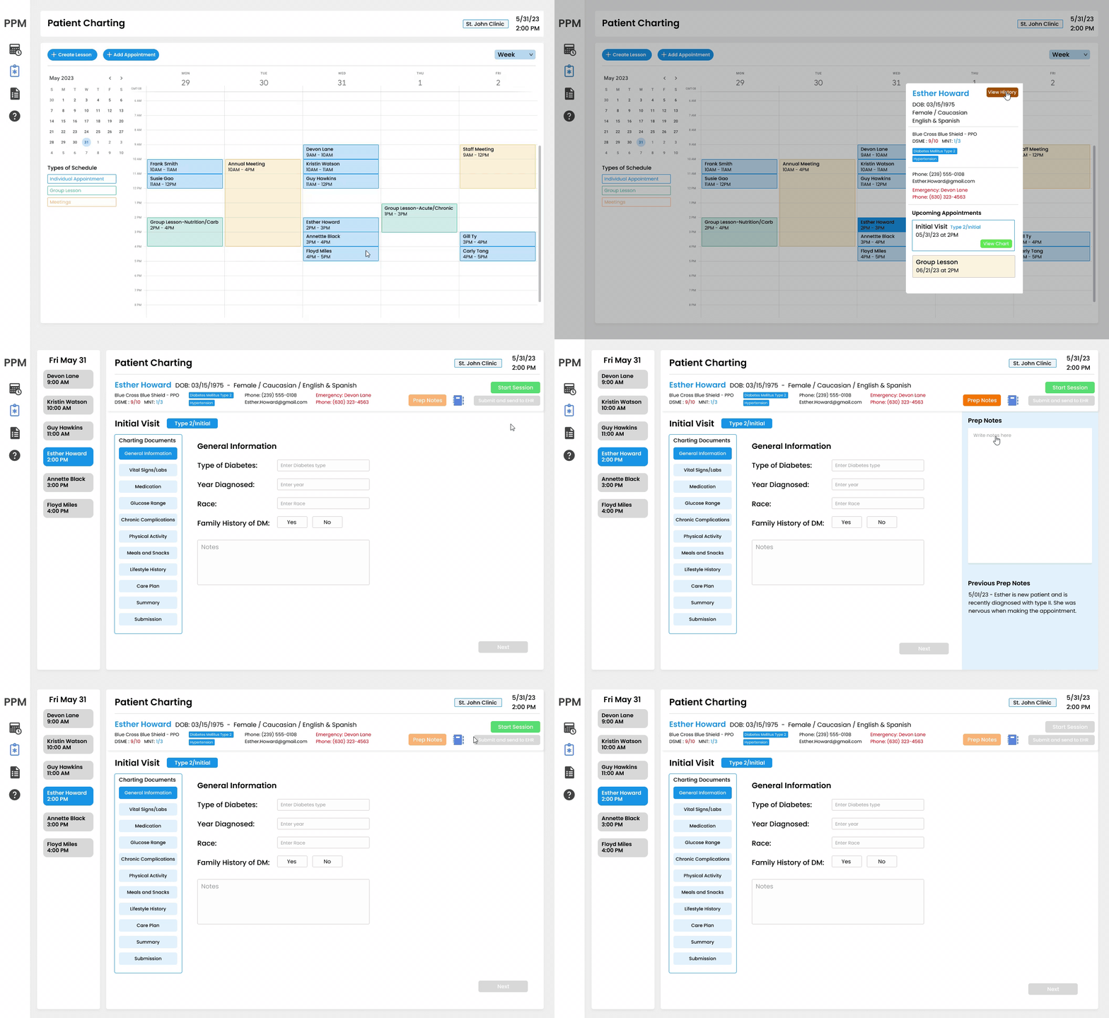
Calendar and prep notes

An 11-section guided flow with persistent context

The charting flow walks educators through every required field: numbered sections, completion checkmarks, and the ability to jump to any section without losing their place. The right panel toggles between Prep Notes and Medical History, so context is never more than a click away.
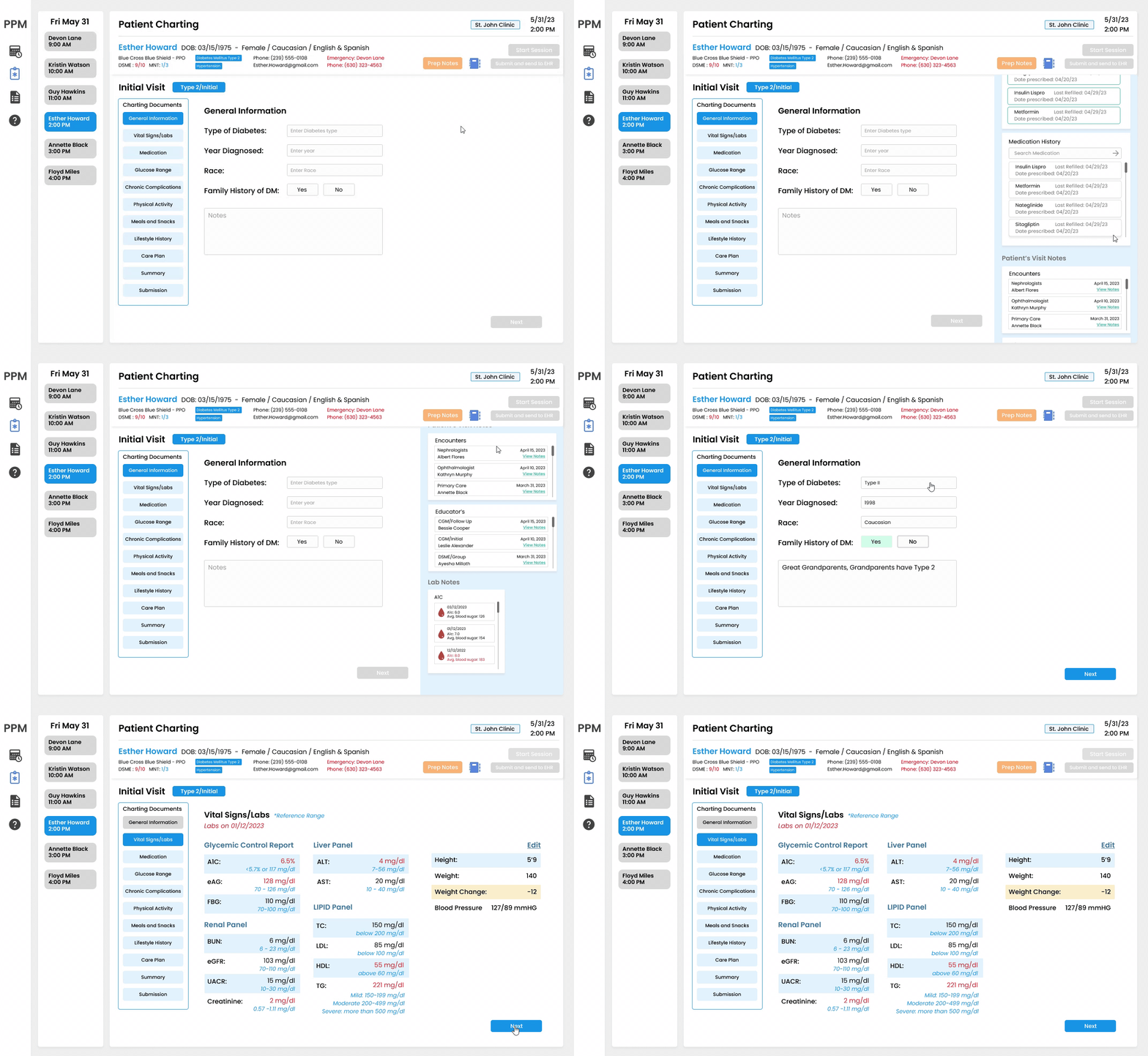
Charting and medical history

Drag-and-drop medication reordering

Medications can be reordered by priority with drag-and-drop. The Medical History panel closes automatically and the list moves to a fixed bottom strip, so source and target stay visible at the same time. No scrolling needed.
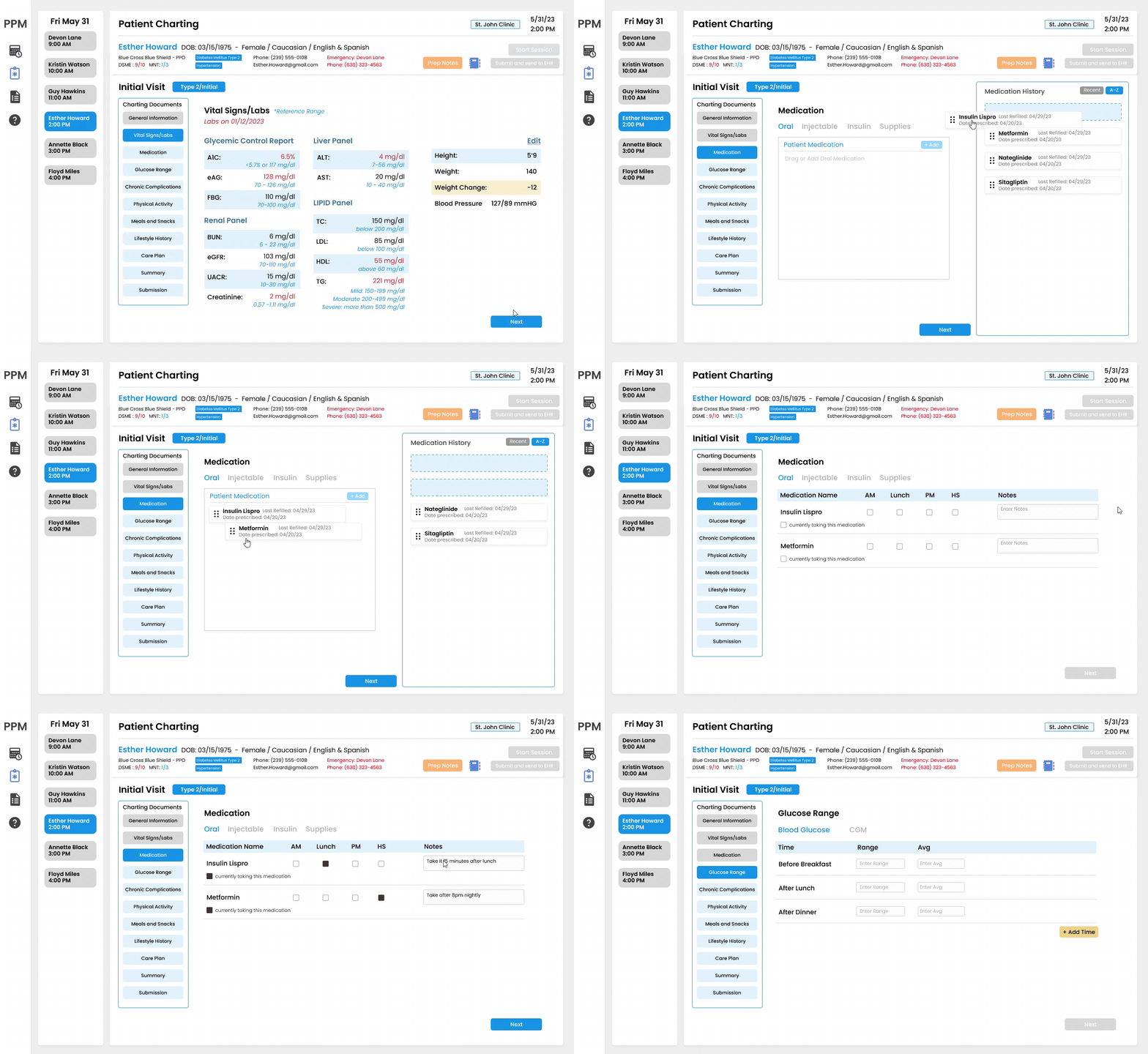
Medication management

Goal tracking across sessions

Goal setting surfaces the patient's previous goals alongside a field to add new ones. Progress bars track completion across all active patients and carry through to the next session automatically.
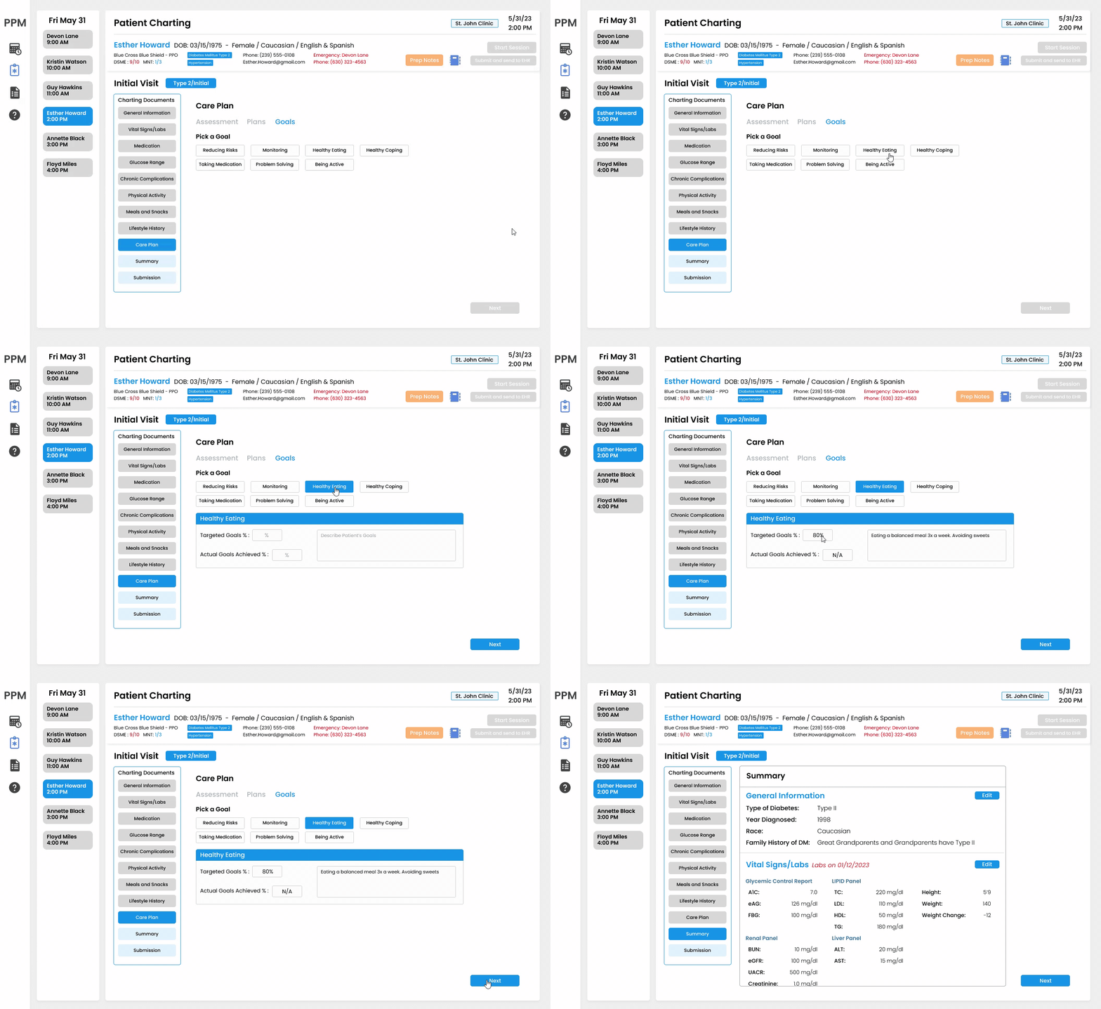
Goal setting

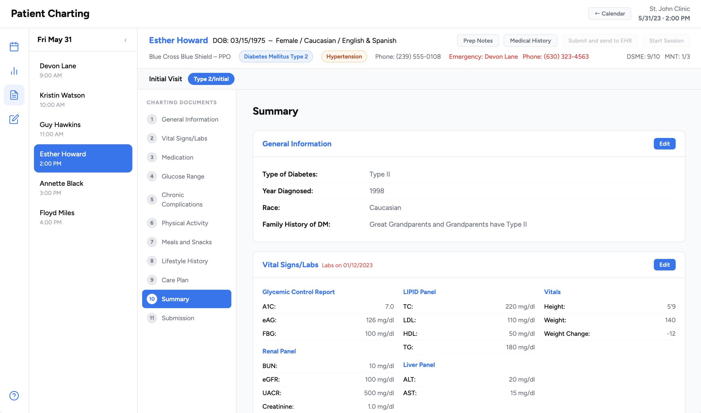
Review and edit before submitting

The summary collects the full chart into one reviewable view before EHR submission. Educators can edit any field inline, see flagged incomplete sections, and submit with one click.
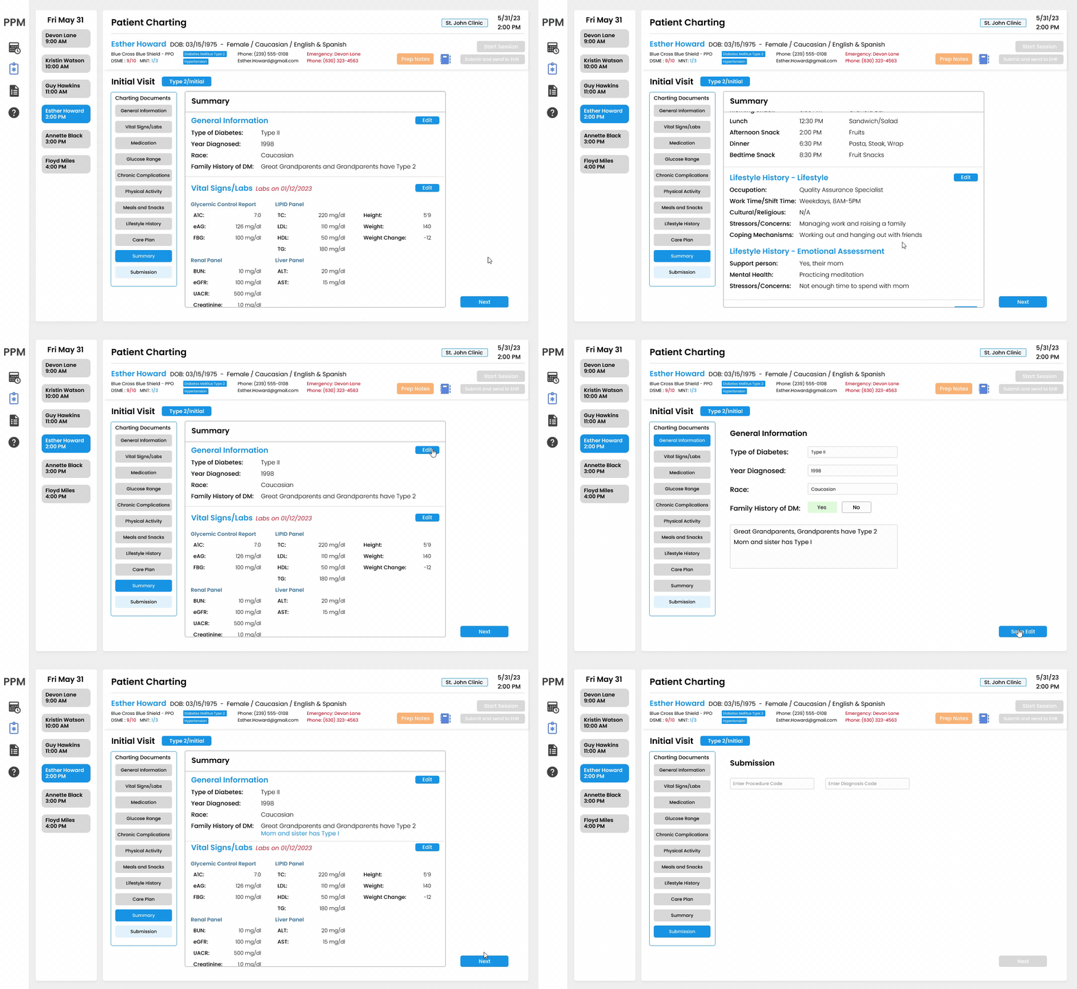
Editable summary

The Business Case

Efficiency Is Also a Business Case

Medicare reimburses clinics per completed patient session under code G0108 for individual DSME visits. The only way to get reimbursed is to submit a complete, signed chart. Incomplete documentation costs the clinic real revenue, not just the educator's evening.

$53.05
Medicare reimbursement per patient per 30 min individual session (G0108, 2025)
40.1M
Americans with diabetes, a growing patient population requiring educator sessions CDC, 2026
1.2M
New diagnoses per year, each requiring ongoing individual charting and documentation
10.1%
Of U.S. adults diagnosed with diabetes. Nearly doubled from 5.9% in 1999 CDC NCHS Data Brief No. 516
Time saved
Before
~40 min charting after session ends
After
~15 min inline, session closes same day

25 minutes returned per patient session. Across a week of appointments, that's over 2 hours of patient care time given back.

Patient capacity
Before
4 patients/day
3 hrs after-hours docs
Documentation burden caps how many patients an educator can see
After
6+ patients/day
Charts close same day. Capacity expands.

With after-hours documentation gone, educators can see more patients per day and clinics can add billable sessions without hiring more staff.

The math

Saved time becomes billable capacity

+2
patients per educator per day4 → 6, once after-hours charting goes away
×
$53.05
per completed sessionMedicare G0108, individual, per 30 min
×
250
clinic days a year
=
~$26.5K
added capacityper educator, per year

A four-educator clinic clears ~$106,000 a year in new billable capacity, without hiring. On top of that, every chart that now closes the same day is a session that gets reimbursed instead of forfeited to an incomplete record. Projected from interview findings, not yet validated in a live clinic.

Competitive Analysis

Every tool covers part of this. None do the whole workflow.

I looked at the software a diabetes educator actually touches, from the ADA's own documentation platform to the enterprise EHRs. Each solves a slice. The gap is a guided DSME flow that also submits to the EHR and drafts the documentation.

ToolWhat it isGuided DSME flowEHR submissionAI documentation
Chronicle Diabetes (ADA)DSMES documentation
EpicEnterprise EHRConfigurable
Oracle Health (Cerner)Enterprise EHRConfigurable
GlookoDiabetes data platformAnalytics only
Cecelia HealthVirtual diabetes clinic
Welldoc (BlueStar)Digital therapeuticPatient-side
My designDiabetes charting + education

Design Process

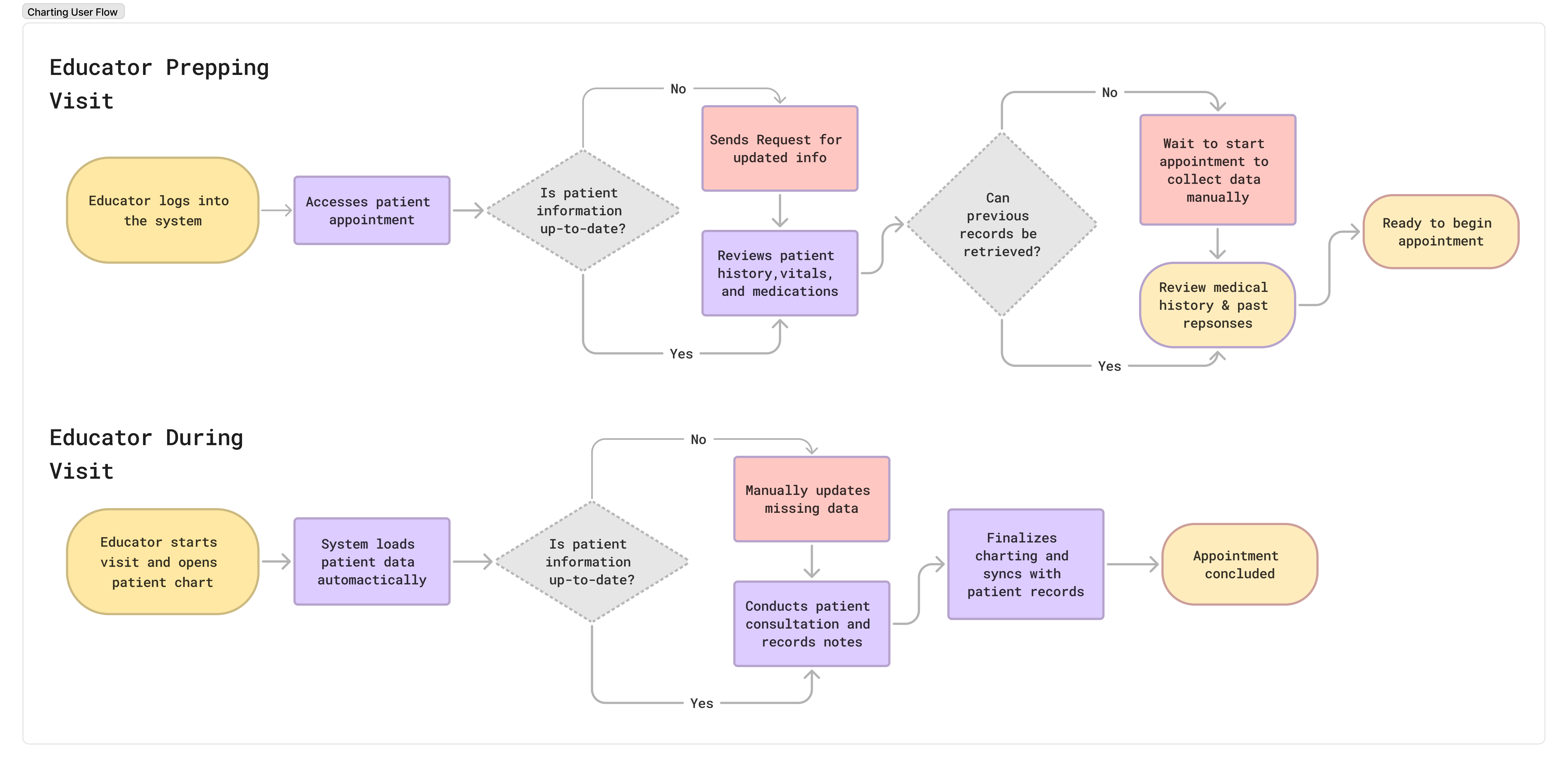
Mapping the Workflow

I visualized the entire workflow, before, during, and after each session, to pinpoint where friction built up and where design would have the most impact.

User flow diagram

From Wireframes to High Fidelity

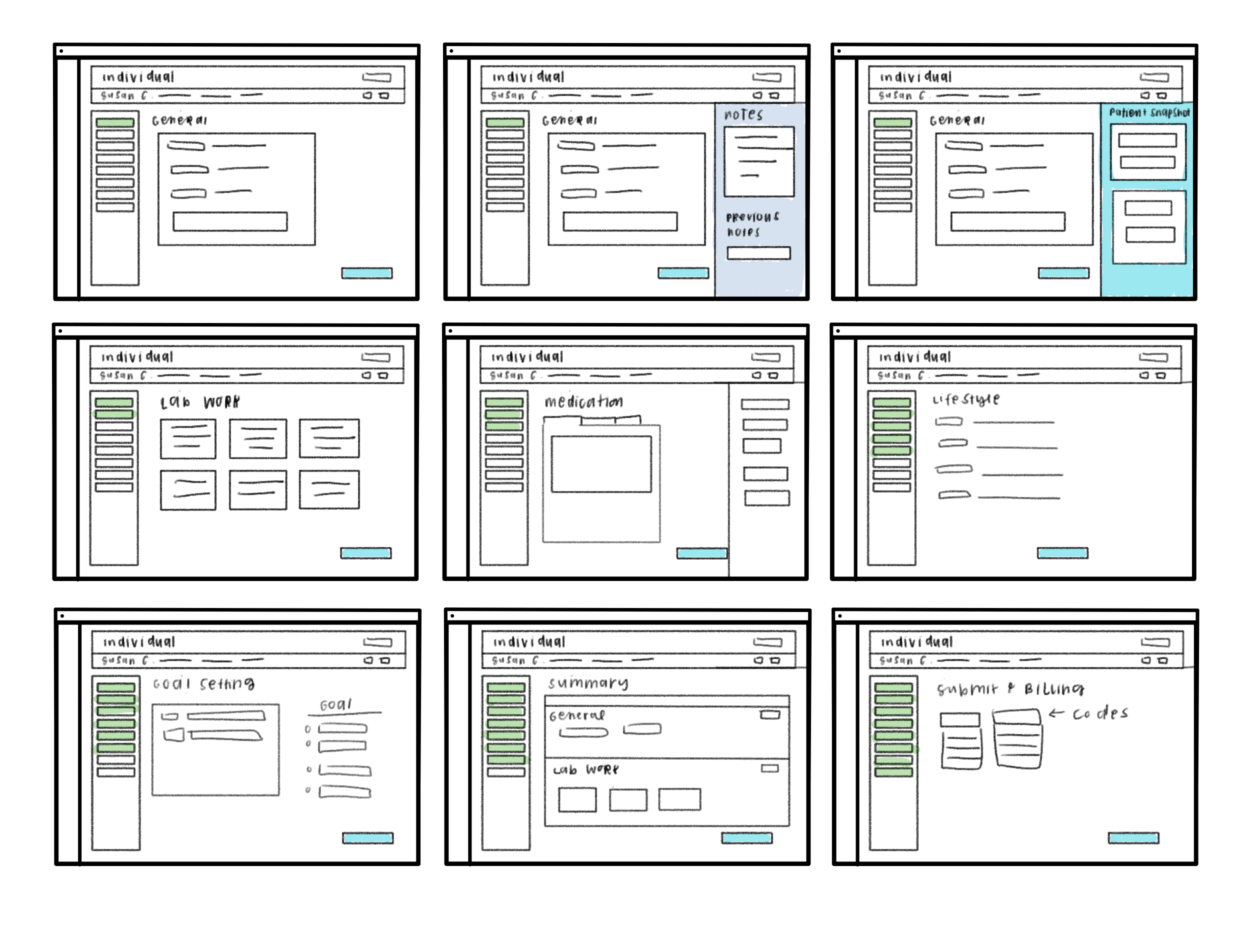
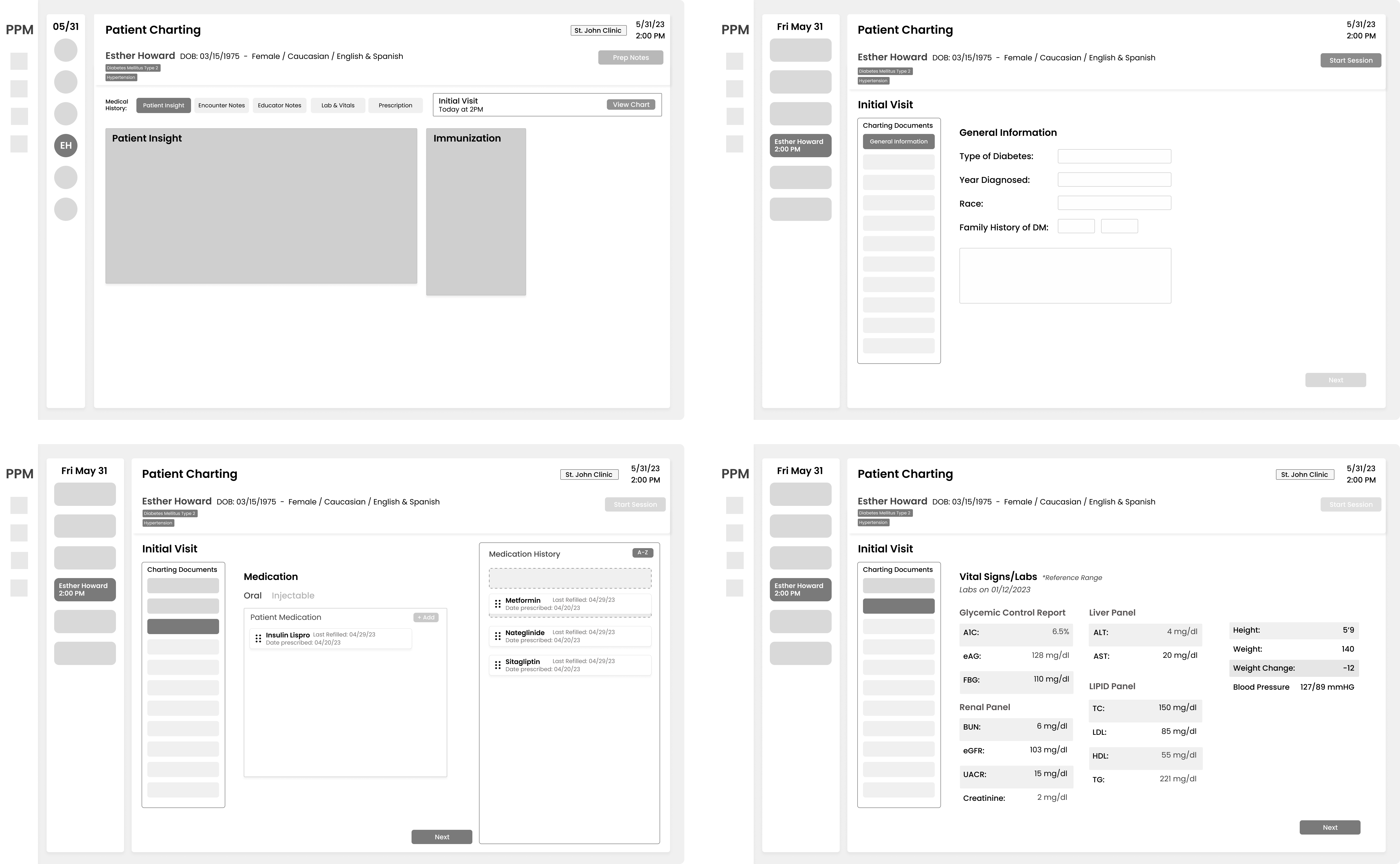
Quick layout explorations to test concepts and settle on a clear structure before the full prototype build.

Early sketches Wireframe explorations

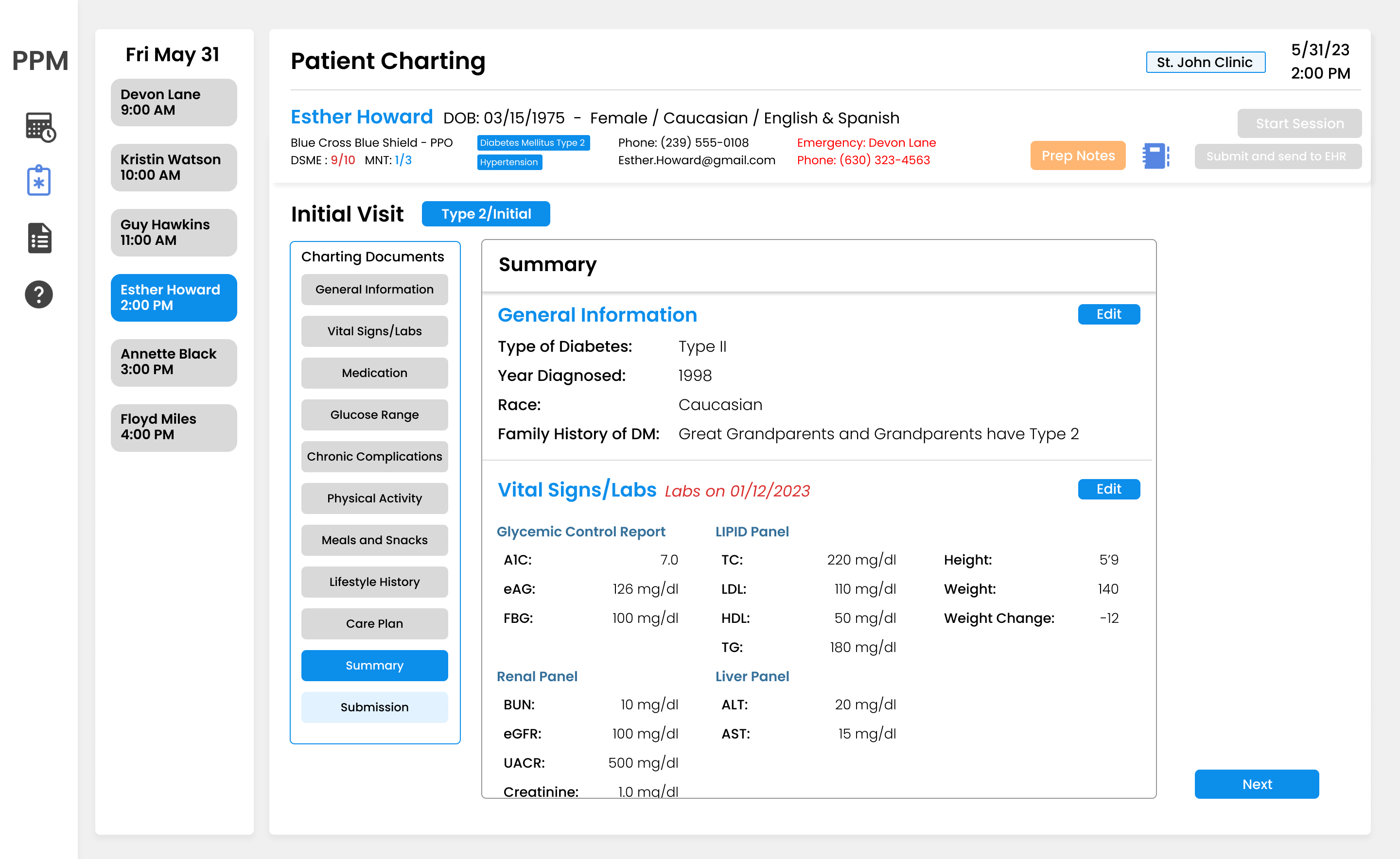
What I Tried and Why I Moved On

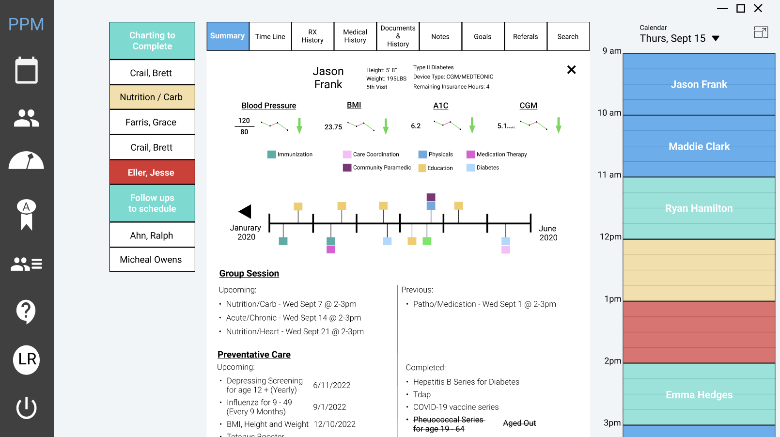
Six iterations before the final design. Each version got me closer to what educators needed versus what I assumed they needed. The biggest pivots came from workflow constraints, not aesthetics.

✕ Scrapped

The design wasn't good enough to replace what they had

The components were too big and the visual design felt outdated. If this is what educators see, there's no reason to switch from their existing tools. The design has to earn that switch.

Why it failedIf it doesn't look better than what people already use, they won't use it.
✕ Scrapped

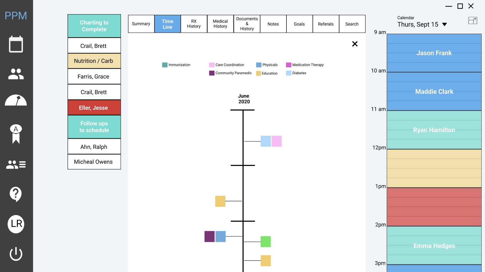
The timeline idea was right, the design wasn't

We wanted to give educators a visual history of the patient over time. The idea made sense but the execution didn't. The layout was hard to read and the information wasn't presented in a useful way.

Why it failedThe concept is still worth exploring. Just needs a better design approach.
→ Evolved

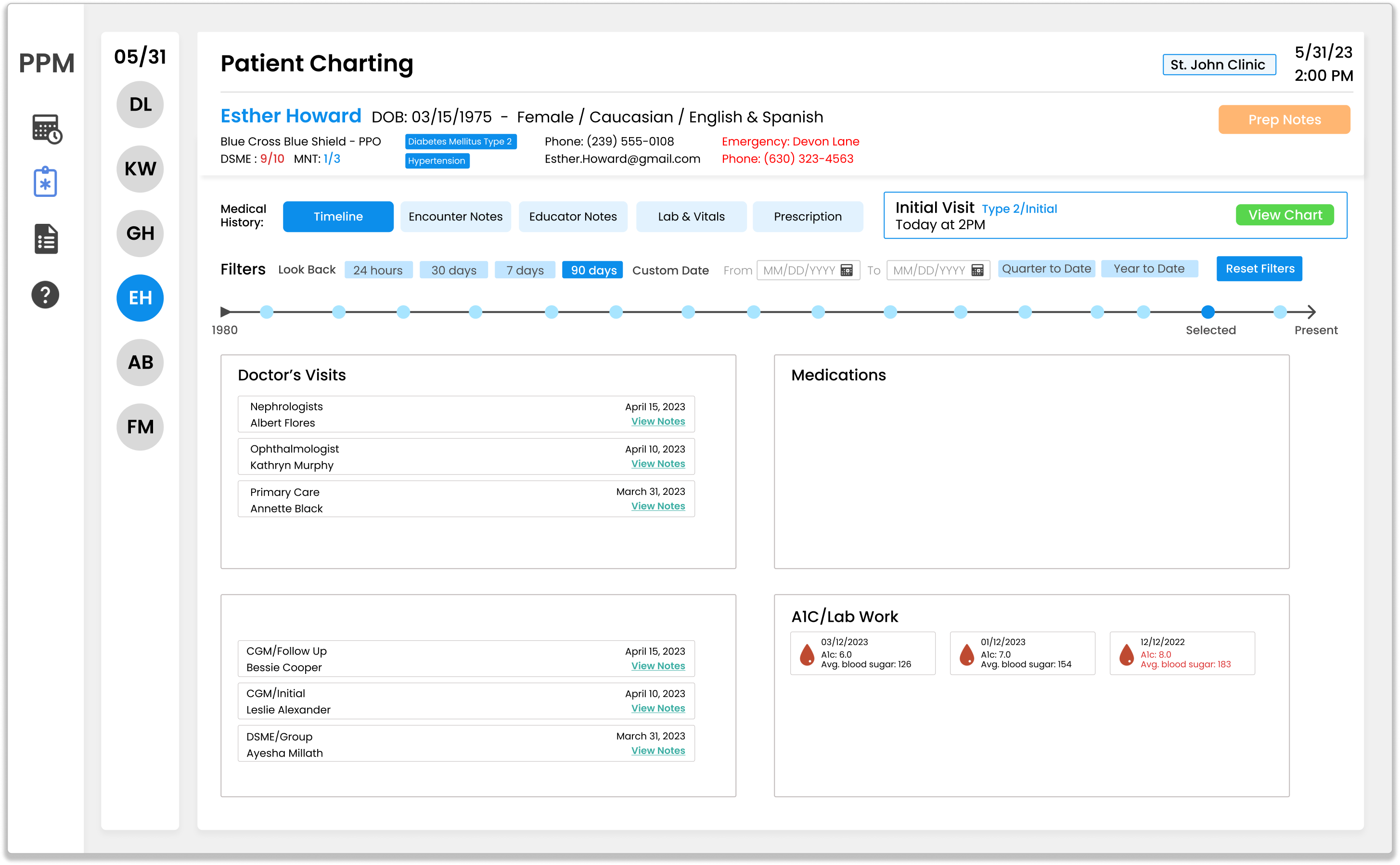
The timeline got better

After scrapping the original timeline, we kept iterating on how to display patient history. The final version is filterable by date range, organized by category, and lives inside the medical history panel so educators can reference it without leaving the chart.

What I learnedThe idea was always right. It just needed more iteration.

Systems Thinking

Edge Cases I Designed For

These scenarios don't show up in a happy-path wireframe, but they come up every week in a real clinic. Tools fail at the edges, not in the center.

Outdated or missing patient data

When records can't be retrieved before a session, the system surfaces missing fields in the charting nav. Educators can flag incomplete data, continue without being blocked, and return to fill gaps later.

Chart left incomplete mid-session

Partial saves appear as overdue tasks in the Dashboard. Each task card shows exactly which sections are missing, how many days late it is, and a "Resume →" button to jump back into the exact section needed.

EHR sync and submission

Procedure and diagnosis codes are entered inline before the e-signature. The Submit button only activates when the chart is signed, preventing unsigned charts from being sent to the EHR accidentally.

Medication conflicts and refills

The medication history strip shows last refill dates and a "Refill soon" badge for flagged medications. Educators see Acarbose is due for refill before the session ends, not after the patient has already left.


Built with AI

Implemented via Prompt-Driven Engineering

Rather than leaving this project as a Figma file, I partnered with Claude to build a fully interactive prototype in real code.

Static design
Figma mockup
A polished screenshot, but recruiters can't feel the workflow. They have to imagine it.
AI-assisted prototype

Taking It Further: The Prototype in Code

One question the wireframes couldn't answer kept coming back: what does it actually feel like to chart a patient in this tool? A static mockup couldn't show me how the AI pre-brief loads or how dragging a medication into the drop zone behaves in context.

So I built the prototype in code, using the same design system and the same patient data. It's fully clickable, not a Figma file wired up with hotspots.

Built with Claude + Codex
Screens 11 charting sections
AI features 3 live integrations
Patient data 6 fully populated
AI interventions across the charting workflow
Pre-Session
✦ AI Pre-Brief
Patient Risk Snapshot
During Session
Goal Recommendations
Clinical Narrative
Lab Flag Alerts
Post-Session
EHR Submission
Auto-drafted Note
AI Features

Where AI Could Enter the Workflow

Three AI integrations that reduce cognitive load at key moments, each tied directly to a pain point from the research.

Pre-Session

Educator Dashboard

Today's schedule with A1C flags, goal progress, and overdue-chart alerts. Click any patient for their full history.

WhyResearch showed every visit started from scratch. This front-loads the context.
During Session

AI Goal Recommendation Engine

In the Care Plan, AI reads the chart and suggests the two best-fit DSME goals with a one-line rationale. Click to apply.

WhyGoal-setting had no feedback loop. Educators get a second read as they set goals, not after.
Post-Session

Clinical Narrative Generator

The Summary drafts an EHR-ready narrative in five labeled sections. One click, review, accept.

WhyAfter-hours documentation was the biggest time sink. Charts close the same day.
Try it
Guided Tour
Step 1 of 8
Complete the action in the prototype to continue.
individual-patient-charting-prototype
Open full screen ↗

Lessons

What I Learned Building This

What Went Well

Working closely with a clinic collaborator gave the project something most design projects don't have: a real workflow to improve, with real friction I could witness firsthand.

Building the prototype in code also revealed design decisions that Figma wireframes couldn't expose, particularly around the panel toggle behavior and the charting nav auto-advance.

What I Would Change

If I could start over, I'd define the exact fields required for charting before designing a single screen. Getting deep into the information architecture revealed conflicts between what was required for billing and what was most useful for educators.

I'd also plan for usability testing earlier, specifically around the dashboard task management flow, which changed significantly after seeing how educators actually prioritize their day.

Technical Considerations

Integrating cleanly with existing EHR systems while staying flexible for different clinic workflows is the main technical challenge at scale. The current design assumes a relatively standardized EHR interface.

The next iteration would include deeper testing with real educators in live clinic environments, and a closer look at how the billing flow connects to existing revenue cycle management tools.